Today, I wanted to talk about making your content easy to scan. And when I say content, I mean any information you read on a screen.
This means, blogs, articles, websites… even emails.
As you know, reading from a screen is more difficult than reading off paper. And this is why paying attention to the medium is important. You want to have people be able to read your message easily.
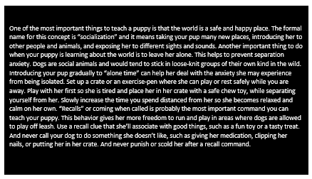
Take the following example.

It’s hard to read for a number of reasons. Big blocks of text don’t look inviting to read, white text on a black background is hard on the eyes, and perhaps most importantly, it’s not easy to scan. It’s a chore to read.
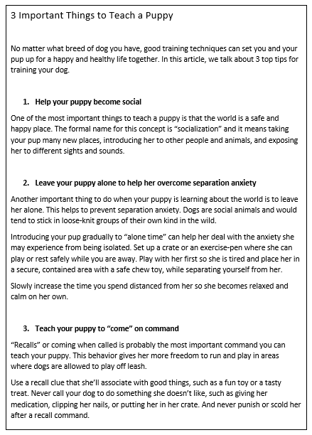
So let’s now take a look at another example.

It’s the same text, just in a different format.
Here’s why it’s better. It has:
- Plenty of white space to give the content “room to breathe”
- Short paragraphs to make it easier to read
- Subheadings in bold typeface to make it easier to scan (subheadings are also great for SEO!)
- Black text on white background to make it easier on the eyes
- Larger font making it easier to read (especially for an audience over 50 years old)
Technically speaking, there are more paragraph breaks in here than you need from an English grammar perspective. However, the more breaks the better because it makes it easier to read. I would recommend no more than 2 or 3 sentences at a time.
And don’t forget, while you might have written some great content, it’s a good idea to have another pair of eyes check it before it goes out. You might want to work with someone to make sure it’s correct, as there’s nothing worse than sending something out with a typo.
Remember, it’s hard to read on a screen. So if you want to make your message effective, make it easy to read.
